Data visualization tools are a part of a broader category of business intelligence solutions that are used to sift through any data or numbers you may have. In order to draw actual benefits from the information you collected, you have to run analytics, and then develop visualizations in order to reach meaningful conclusions….
read more

What is Data Visualization?- Introduction to Information Imaging
Data visualization is information and data depicted in the form of charts, graphs, and other graphic elements. Data viz constitutes a crucial part of the data analysis, aiming to make information easier to understand and act upon. Visualization tools serve to process and present collections of data in a comprehensible way in order to help their readers pinpoint patterns and anomalies in substantial data sets which may be otherwise difficult to navigate. Visualizations are created to communicate interdependencies between pieces of information and convey them using images.
Making sense of big data
Alright, so you’ve collected a ton of big data but what…
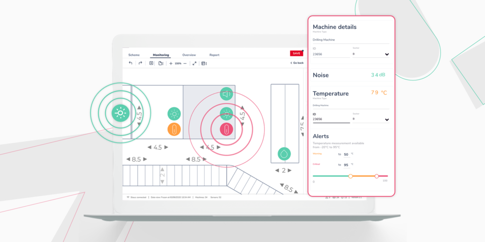
4 unobvious uses of real-time data in diagrams
Data visualization, as commonly understood, is used to increase readability through the graphical representation of data. You can achieve it in different ways. One of them is the use of diagrams. When accurately designed (e.g., using the GoJS library), they enable effective communication and process mapping. On the example of our tool for building smart production lines – Smartly – you will find out 4 functionalities that support working with real-time data in diagrams.
If you’re dealing with diagrams or just looking for solutions that are right for your organization, know that this type of data representation can affect your work with data. The added real-time performance points to even more benefits. These are…

Front-end solutions in IoT. A new trend or pipe dreams? Let’s find out!
IoT is no longer a purely technical subject. Until now, those who preferred to grab tools and design devices supporting the development of the Internet of Things were mainly interested in this topic. However, the perspective of 2020 has shown that the industry people are increasingly looking towards the clear presentation in the front-end layer. It would mean that there is a trend in greater attention to aesthetics and usability for business tools, especially those that support smooth decision-making.
We asked our Pre-sales Expert and BA about his insights into IoT development towards the front-end. He tells not only about trends but also answers the…
3 lessons learned in 2020 for a better 2021
Traditionally, the end of the year is a good time for a summary. For us, the beginning of 2021 is the moment when we take a deep breath and plan our strategies for the next twelve months. Although 2020 wasn’t the easiest one, it brought three positive lessons for Synergy Codes that we want to use in the future. As Maciej Teska, the Synergy Codes CEO, said: ‘We almost walked dry through the global crisis caused by the breakout of Coronavirus. It makes us believe that in 2021 we can develop further and expand our competencies to surprise our customers.’
Here’s the story on the conclusions we have drawn from the undoubted breakthrough…
Stay tunned
To be always updated, share your e-mail and subscribe to our newsletter to get the freshest feed from our blog.
[mailpoet_form id=”1″]

