Category: Data Visualization - page 3
Perfect diagramming software is a myth. At the same time, you can’t say it doesn’t really need to exist. Each solution aims to meet business demands in the most appropriate way to increase the effectiveness of the company. Going custom with charts and graphs means meeting the requirements and needs of the companies of each size.
While ready-made solutions…
read more
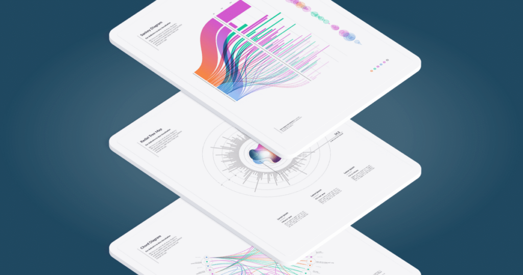
Seven great examples of custom diagrams and graphs usage for business
Data is a constant element of business. Presenting data via custom diagrams and graphs, they become a source of knowledge. What is more, they change into a powerful analytical tool that has a huge impact on the functioning of the business. The diagrams and graphs themselves provide the basis for well-presented data, its understanding, and use.
Learn seven examples of the real-life use cases of custom diagrams and graphs in business.
Diagrams and graphs differences.
But before we get to the icing on the cake, it’s worth knowing the fundamental difference between diagrams and graphs.
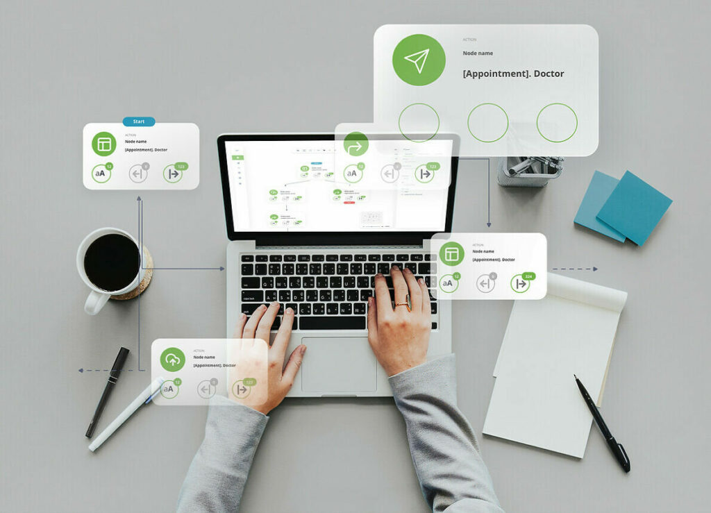
A complete guide to GoJS JavaScript library
Created by developers for developers, the GoJS is a skyrocket JavaScript library dedicated to building interactive diagrams and graphs. While being the most trustworthy resource, GoJS has been adopted as one of the most useful libraries for data visualization tools’ crafting.
The article covers the business and technical benefits of the GoJS library. To dive deeper into the topic, you can download the GoJS e-book. It’s a comprehensive publication filled with the knowledge and experience related to technical and business GoJS aspects
Introduction to GoJS diagramming library
The GoJS library was launched in 2012 by Northwoods Software – a tech company focused on providing…
Top Types of Charts & Graphs For Expert Data Visualization
Data visualization plays a crucial role in BI. Learn the best types of charts and graphs that will bring the information you collect to life.
Business data stacks are growing by the day. It’s imperative for organizations to turn the raw data they collect into easier to digest forms using visualization. Presenting information in a graphical manner makes it more meaningful and engaging. There are many types of graphs and charts available that can neaten large amounts of data which may otherwise be difficult to process and make sense of, especially for a non-specialist. The following article discusses what chart types are the best and what…
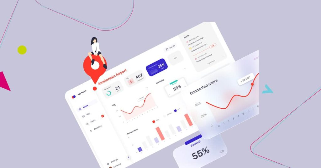
What is Interactive Data Visualization And Its Benefits
Interactive visualizations are produced using data visualization tools which allow for direct modification of elements on a graphical plot. The idea is to create charts and graphs which the end-user will be able to personally explore and adjust and not just read passively.
Essentially, interactive data visualization has an advantage over static representations of data in that it offers tools for engaging with the information shown in real time, allowing the end user to see more details, generate new insights and questions, and squeeze more juice out of the available data sets.
Game plan for creating interactive data visualization
When trying to develop interactive…
Stay tunned
To be always updated, share your e-mail and subscribe to our newsletter to get the freshest feed from our blog.
[mailpoet_form id=”1″]

